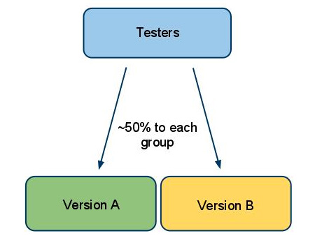
An A/B test is simply a test to see how your market responds to two different approaches. You may be testing different content, colors, graphics… it doesn’t matter. The key is to find which of two different versions is most effective.
When you’re looking at many different features, you can run what’s called a multivariate test, but that’s considerably more complex, so for now, we’ll talk about a simple A/B test.
Why to A/B test
First, let’s talk about why you would want to run an A/B test… there can be several reasons, but typically, they’ll end up at the same point: conversion rate.
Conversion may mean subscribing to a newsletter, responding to a poll or ordering a product or service. Your conversion rate is the percentage of visitors to your site that complete the desired action, whatever it may be. Let’s look at an example:
Let’s say you sell women’s jewelry – not junk, but quality costume jewelry. You’ve been in business for 3 years, have established some faithful repeat buyers and your SEO efforts have gotten you to the point that you receive 2,000 unique visitors per month.
1.5% of those visitors (30) make a purchase, so since your average gross profit per sale is 50%, (average sale price is $100), you’re making about $1,500 per month.
A friend shares with you that he thinks your site is ugly, and that his next door neighbor, that also sells “the same stuff”, has a “really nice” website, and he makes nearly $5,000 each month.
That might make you think, right?
So you talk to your SEO, your designer and a few marketing friends – the general agreement is that your site is ugly and could be improved. Everyone offers some suggestions, some of which sound pretty good, but few agree with each other. So you pick a couple that seem to show the most promise and decide to test them against each other.
Setting up a test
We’ll say that you’re going to test between a rectangular, red BUY button and an oval, green BUY button. One method is to build two different pages, similar in all other regards, but each one with its own button. You then route similar groups of potential buyers to each page and see which has the greater success.
Another method is to do the testing in your newsletter, sending two different versions out to two similar groups. One will have the red, rectangular button and will give them a link to the sales page, with instructions to use the discount code REDREC.
The other group’s newsletter will have the oval, green button, will link to the same sales page, but will tell them to use OVAGRN as their discount code.
NOTE #1: It’s very important that the two groups be as similar as possible, in terms of demographics. Since it’s difficult to construct a demographically equal group, you want to use as large a group as possible. That will lessen the effects of minor differences in the groups’ makeup.
Let’s assume that whichever method you used, you dealt with two groups of 1,000 users each. Previously, you’ve been seeing a 1.5% conversion rate, using a small, plain, gray square button. It can only improve, right?
So you run your test, and analyze the results. You find that the REDREC group gave you a 1.7% conversion rate. Nice!
But the OVAGRN group showed a 2.3% conversion rate! That’s over a 50% improvement from what you’ve been doing!
So you make the oval green button a permanent fixture, because it can mean nearly $10,000 more in your pocket every year.
The Reality
You have to understand that the percentage you achieve in your A/B testing may or may not materialize “in real life”. Your test conditions were the same, so you shouldn’t see a lot of variation. But there will always be some. Subsequent efforts may be slightly better or worse, and will certainly vary from day to day, just as they always did.
You can run A/B tests one after another, fine-tuning various aspects of your sales funnel. I just suggest that you not try to run more than one test at a time, until you’ve gained a lot of knowledge about how such results can intertwine and affect each other.
Note #2: In an A/B test, never allow more than one variable.
Think about it… if you change two things, say the BUY button and the content in the same run, how would you be able to say which caused a change in conversions? For that matter, what if one change would have caused the rate to jump from 1.5% to 2%, but the other would have caused it to drop to 1%? They’d cancel each other out, and you’d miss out on an opportunity for a 33% increase in conversions.
Where to Test
You can use newsletters, emails, social media, forums… there are even some online businesses that still send out snail-mail offers. There are variations in structure, as well. You can avoid the different discount codes and simply test one group today and the other a couple of weeks later.
The key to effective testing is to always have total control over the variables that can affect the results. The sad truth is that most “testing” done by marketers and SEOs is flawed from the beginning, due to too many variables. Designing your test properly is 90% of the battle. Get that right and you’ll get results you can have confidence in.


